UNANNOUNCED PROJECT
A collection of interactive VR mini-experiences, each with distinctly different emotional goals and unique interaction mechanics.
MY ROLE
Level Design, Experience Design, Blockout, Design Documentation
PLATFORM
Oculus Quest
TOOLS
Unity, Photoshop, Figma, Notion, Miro, Tvori, Pencil + paper
Over the course of 8 months, I worked closely with developers to bring to life 20+ prototypes exploring our team’s innovative ideas for short, engaging VR experiences. I produced detailed feature sketches, iterative design documentation, and testable blockouts to effectively understand the feasibility of each concept. In this breakdown, I will outline my design process for two of these prototypes.

THE HUNGRY ONE
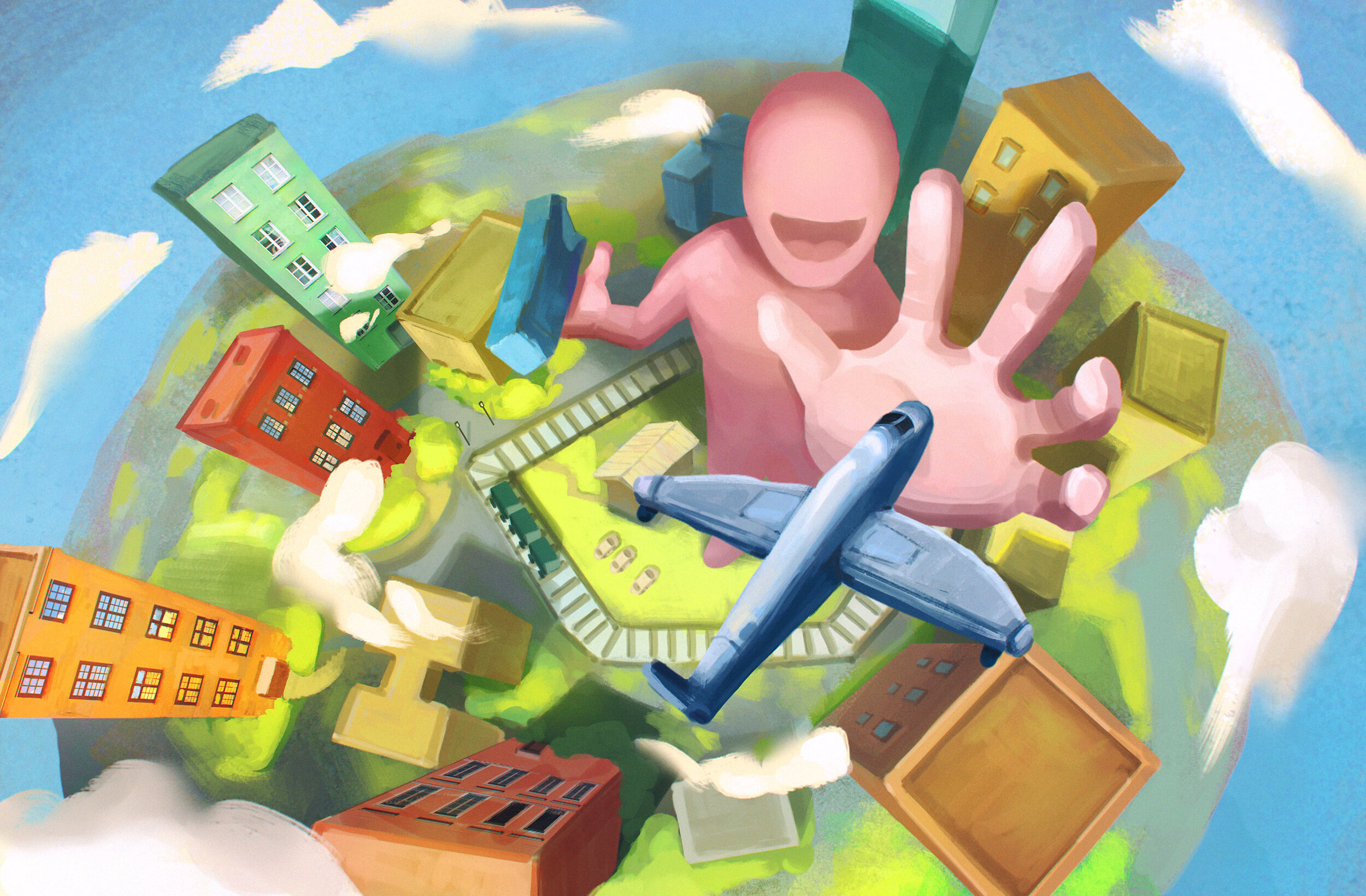
A ‘Katamari Damacy’ inspired VR experience where you are able to eat everything in your environment to grow to ridiculous scales. Download the free game for Oculus Quest here.
A brief portion of the final prototype that was released for this experience.
THE HUNGRY ONE // EXPLORATION
IT STARTED ON A WHITEBOARD
During early exploration, it was my role to lead ideation meetings to come up with interesting ideas for these mini experiences. During COVID, our meetings were held remotely on Miro, a useful collaborative whiteboarding tool. In one of these meetings, I pitched an idea based on the game, Katamari Damacy, where you were able to endlessly consume your environment in VR.
The first ideation sketch for the experience. The dots on the left represent votes made by the team for the idea.
REFINEMENT SKETCHES
After we had found an idea that we all were excited about, I explored the idea further through more detailed digital sketches. I was able to help the team better understand the full scope of the idea by outlining the core features and interactions that were required to create the experience.
A simple digital sketch demonstrating the core loop from the player’s POV.
Building an experience for the stand-alone VR headset, Oculus Quest, meant that performance was always a constraint. We identified that this experience would require a heavy amount of physical objects in any given scene since the player can grow infinitely large and will need a consistent source of edible objects to continue growing. I pitched a rough level system in which the player transitions between areas when they grow too large, making any previous edible objects too small to grab.
An early environment sketch of the game world.
ANSWERING QUESTIONS WITH ROUGH PROTOTYPES
Developers were able to build out quick and dirty versions of the mechanics based on my sketches which allowed me to blockout a rough environment for testing. We were able to resolve many of our initial concerns through this testing process and this first blockout acted as the primary "proof-of-concept” to solidify the team’s belief in the potential of the experience. The developers and I worked together to come up with a list of exposed variables that I could tweak to refine the player experience. I built prototype documents in Notion, a collaborative documentation tool, which allowed us to list all the prototyping insights and testing instructions to the rest of the team.
The first blockout of level 1 (The house).
The colours acted as a rough way to delineate different levels.
Gameplay showing the transition from level 1 (The house) to level 2 (The Town) by growing through the roof.
THE HUNGRY ONE // FINAL PROTOTYPE
DETAILED DESIGN DOCUMENTS
After the team had ‘bought in’ to the idea, we created a higher fidelity prototype that we would publicly release into the wild to get feedback on the experience from a larger VR audience. We used the insights gained from the early prototypes to avoid pitfalls that would have gotten in the way of players authentically experiencing the idea. In preparation for building the final prototype, I was tasked with creating a more thorough design document which would contain detailed breakdowns of the features supported by descriptive graphics and diagrams.
A storyboard depicting the core eating interaction.
A user flow of the entire experience.
A scale reference for all edible objects created in Figma.
REFINED BLOCKOUT
When analyzing the insights that came from the early prototypes, we focused on smoothing out any frictions that came up during internal testing, and expanding upon the moments of joy. I was then able to give myself a few design pillars to keep in mind while working on the refined blockout for the prototype.
Friction — “I keep needing to bend over to pick up things I want to eat”
Design Pillar — Create a consistent flow of edible objects within comfortable reach at all points during the experience.
Friction — “The mountains feel strange to eat because they’re so large”
Design Pillar — Objects within the same level should not differ too heavily in scale.
Moment of Joy — “I loved eating that line of trees quickly in a chain”
Design Pillar — Place edible objects in a way that allows for satisfying eating methods.
A full playthrough of the final prototype that was publicly released for feedback.

WITCH’S PET
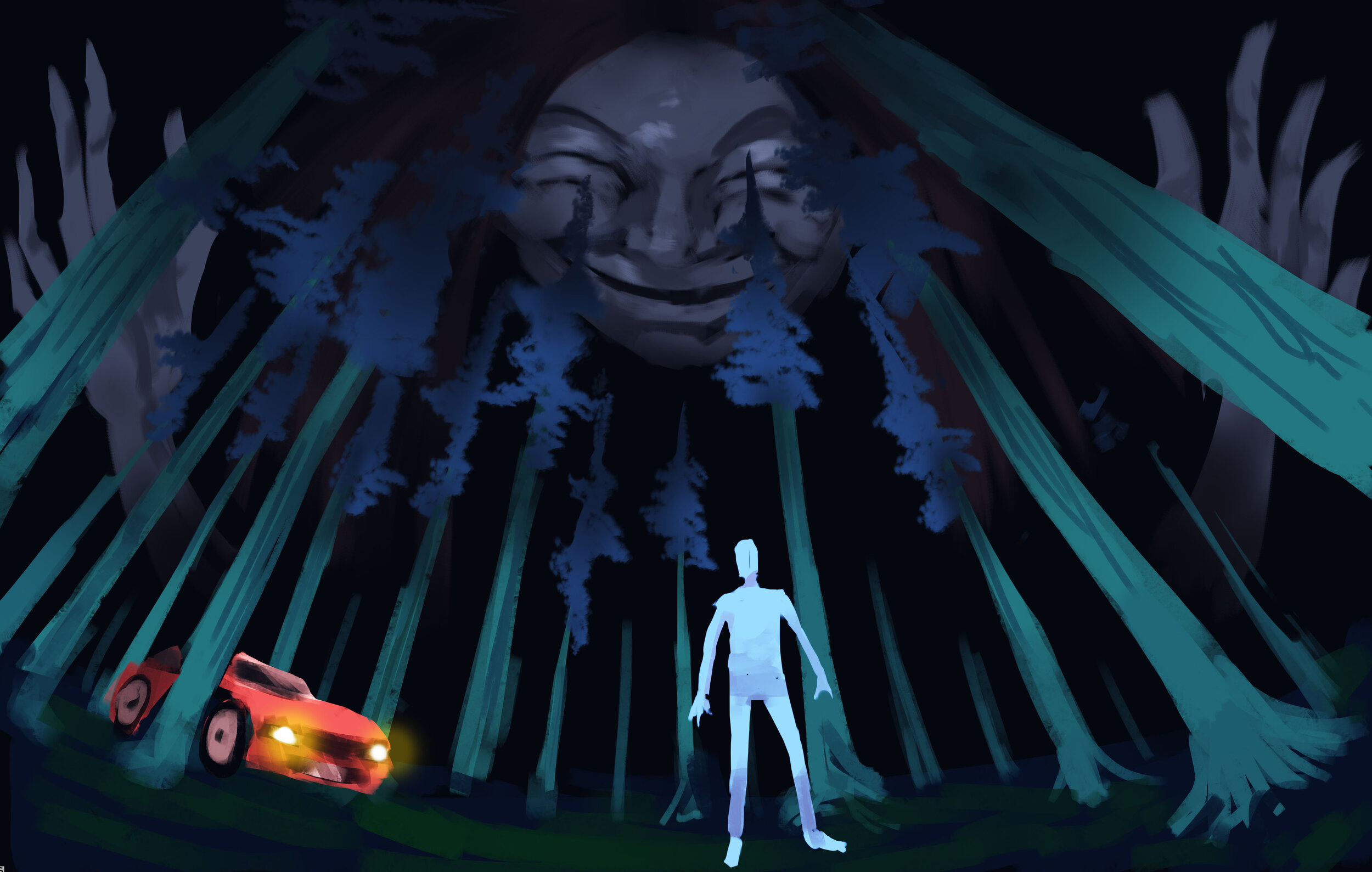
A short experience where you navigate the enclosure in which a giant witch keeps you captive as a pet. You can then escape before she chases you down a winding, treacherous path.
A full playthrough of the Witch’s Pet prototype.
WITCH’S PET // EXPLORATION
BEING WATCHED BY A GIANT
I pitched this idea after seeing a trailer for an upcoming indie game called Militsioner, where a giant policeman is constantly watching you to make sure you don’t escape a village. I thought that this feeling of ‘being watched’ by a giant, omniscient being would be enhanced from being experienced in VR. We started prototyping based off a quick storyboard I had sketched in which the player is trapped in a simple forest environment while a giant witch head watches them. After experiencing the prototype, we immediately had the feeling of being kept as a pet which we ended up using a core design pillar going forward.
The early storyboard sketch depicting the pitched experience.
Being watched by the witch in an early prototype.
THE ‘FISH TANK’ ITERATION
For the next iteration of the experience, we explored the idea of having the player’s environment be more like an animal enclosure that the Witch had built to keep the player captive. The environment required more exploration along a linear path, allowing us to better streamline the experience to stage the more impactful moments. We added details to hint at the fact that they are a pet, like a giant food dish, a deceased previous “pet” (human skeleton), and the Witch peering at the player through a glass wall as if the player were a goldfish.
A sketch of the ‘Fish Tank’ environment showing the various zones and the events that occur in them.
The finished blockout for the ‘fish tank’ iteration.
The Witch peering at the player from behind glass.
WITCH’S PET // FINAL PROTOTYPE
GIVING ZONES A MORE A DISTINCT IDENTITY
We found from internal testing that our experience was lacking a climactic ending. So for the final prototype, we split the experience into two designated zones — “The Nest”, in which the player has a slower-paced exploratory experience, and “The Chase”, a high-intensity chase sequence in which the player has to excape from an angry witch. I used a VR prototyping tool called Tvori to blockout these scenes with simple animations to align the team’s vision before implementation. I also used the graphic editor, Figma to create graphic assets to portray the gameplay areas and gameplay beats.
A diagram drawn over a 3D sketch of the environment I had made in Tvori depicting the two zones that make up the experience.
A 3D mockup of the Witch’s introduction made in Tvori.
A graphic diagram going into more detail for “The Nest”.
GAMEPLAY BEATS
I designed a series of linear gameplay beats, each with a specific purpose in providing the player narrative and gameplay related information. It’s always a challenge to effectively tell a story through gameplay in virtual reality, but we hoped that these beats would help players gain an understanding of their context in the space, and understand how to proceed through the world.
The Witch’s Reveal
As the player enters the nest, I tried to enhance the witch’s entrance by framing her face with rocks and creating an ominous underlit lighting from a central campfire. The witch then persists with her eyes following the player, creating a sense of unease.
Escape Attempt
When the player eventually attempts to leave through the one visible path out of the nest, the witch’s hand slams down, blocking their escape. This slam causes a nearby wall of rocks to fall, revealing a hidden cave.
The Flare Gun
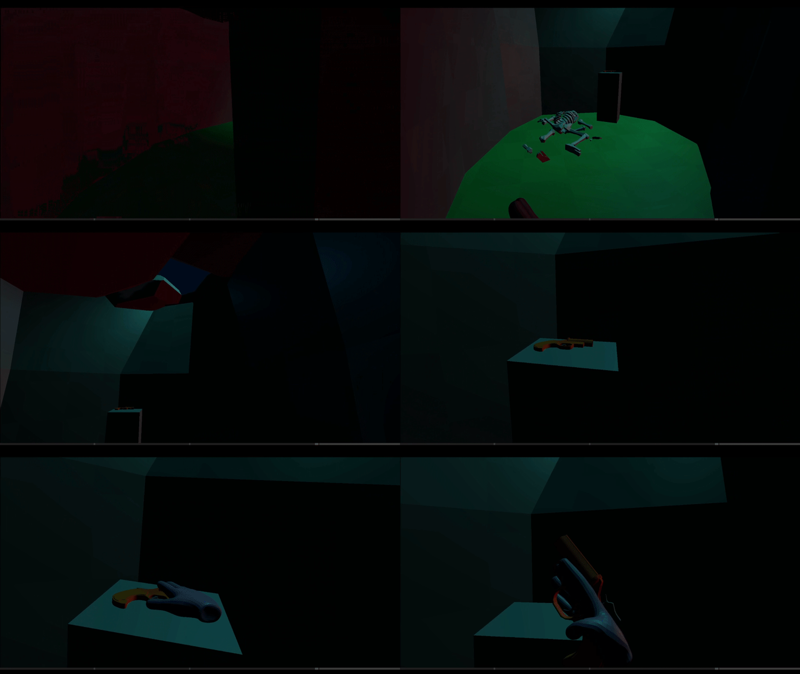
Within the cave is a skeleton of the previous “pet”, along with a flare gun left in their possession. This, along with the hand blocking their escape, provides a sense of added danger, giving the player a reason to want to escape.
Go For the Eyes
We made the witch’s eyes large and bright to constrast against her dark green skin. The player should intuit to use the one tool they’ve been given, the flare gun, to shoot the eyes of the witch which defeats her for the time being.
The Witch Returns
The player can then descend the slope from “the nest”, into a long rocky passage with their goal in the distance. Half-way across a thin, Khazad-dûm-like bridge, I timed the witch to angrily fly up from a layer of fog, and begin chasing the player towards the exit.
A Winding Chase
The player must utilize quick thinking and our ‘arm-swinger locomotion’ to navigate a series of tight passageways and bridges. When creating the blockout, I gradually escalated the complexity of the passages to give the player a chance to get used to making quicker, tighter movements using their locomotion.
REFLECTION
It has been a tremendous learning experience working on so many separate projects consecutively. With each prototype, I gained a better understanding of what goes into the prototyping process. Prototyping is all about understanding ideas and solutions with as little effort as possible. With some ideas, more effort is needed for it to be properly validated but you can always be strategic in where you place that effort. I found that for some prototypes, having higher fidelity art was hugely important in gaining buy-in for the idea and for others, art didn’t matter as much as responsive feedback on interactions. Overall, it has been a blast exploring so many different ideas with talented people.


