LEVEL DESIGN FOR GAMES
A showcase of my work from CGMA’s level design course.
MY ROLE
Level Design, Blockout, Drag-and-drop Scripting
TIMELINE
10 Week, Online Course
TOOLS
Unity, Probuilder, Quick Scripts, Pen + paper
MY INSTRUCTORS
Co-Lead Game Designer @Naughty_Dog on The Last of Us Part II and Uncharted 4.
Level Designer at @SquareEnix JPN. Previously @InsomniacGames.
I built the following levels using Unity and Probuilder. I focused on building spaces that are comfortable to move through while also effectively communicating gameplay options. I used drag-and-drop scripts to implement simple mechanics and form a playable experience.
ANCIENT RUINS
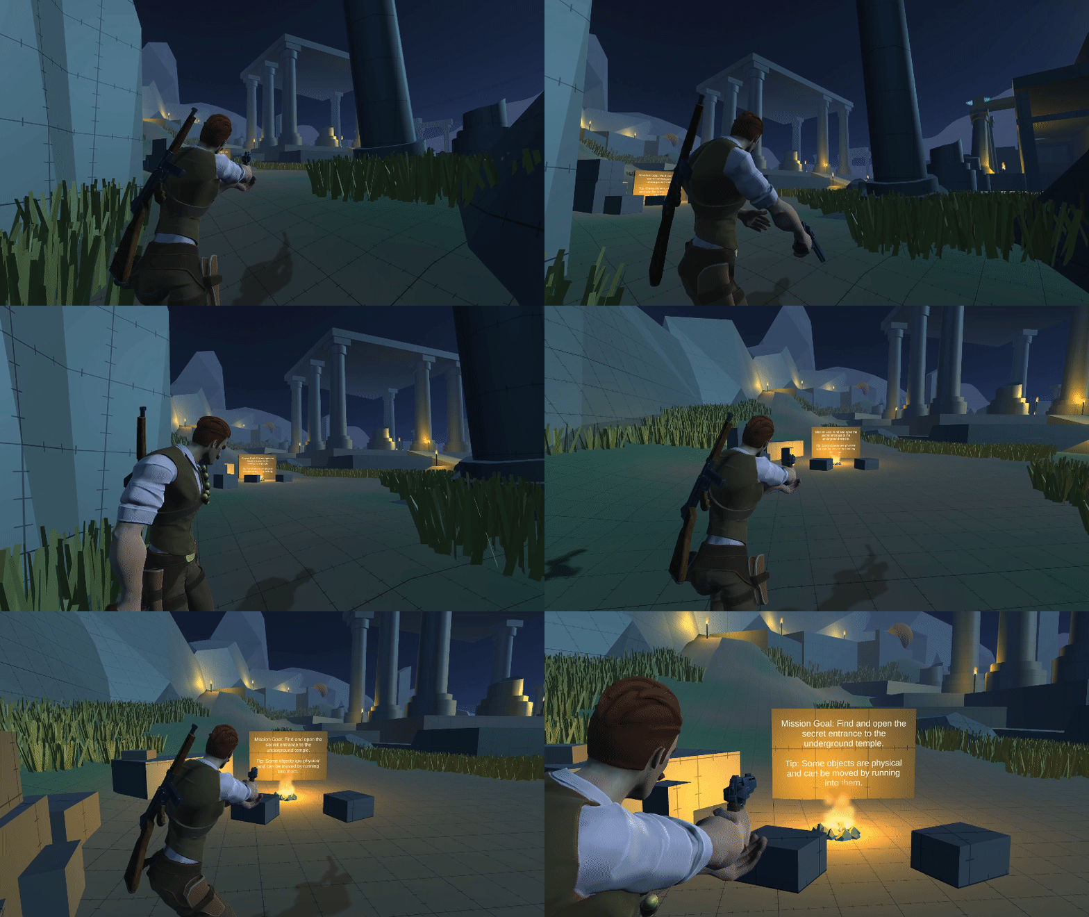
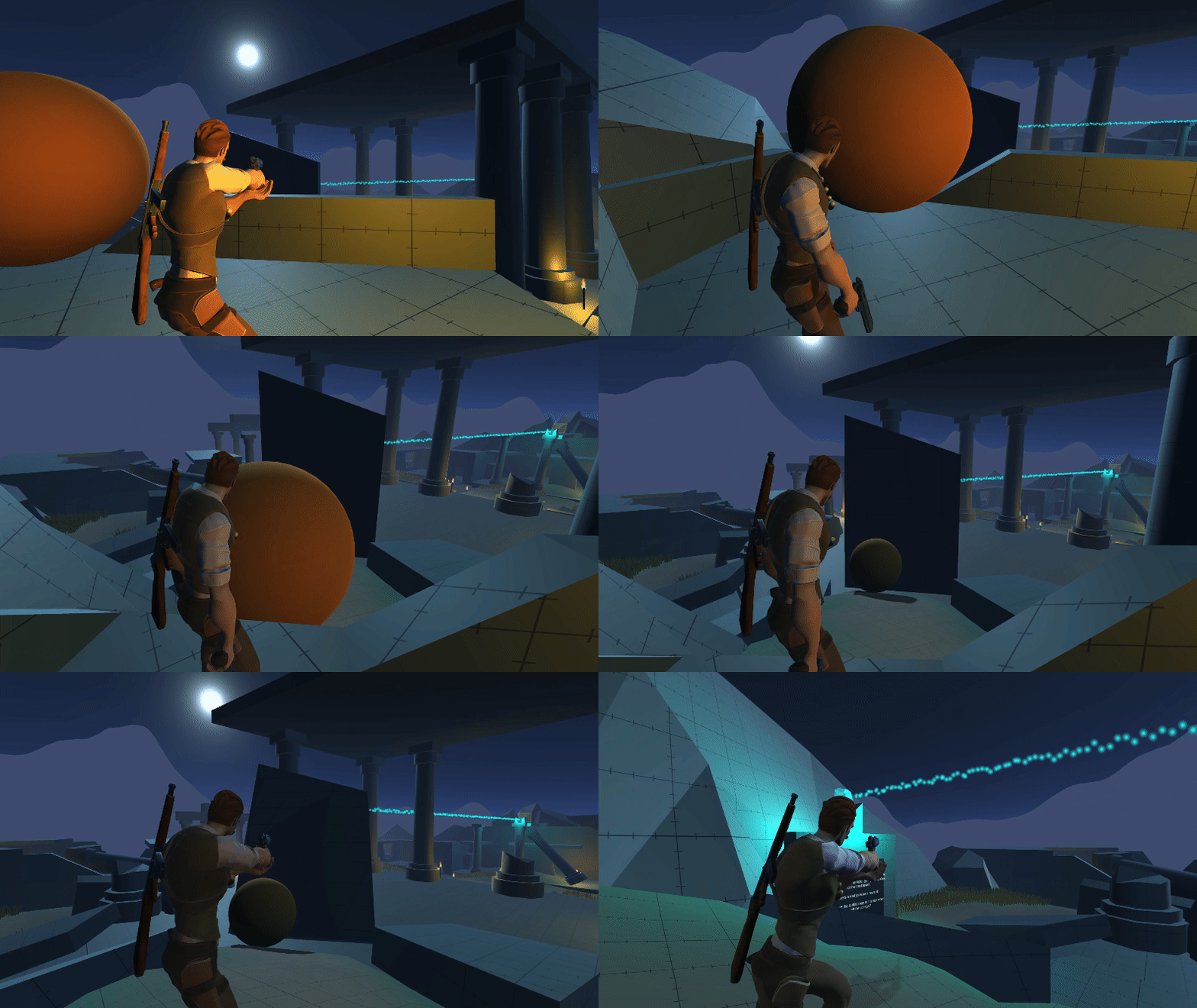
In this ‘Uncharted’ inspired level, the player encounters a series of spatial deduction challenges to solve a simple puzzle. I carved out player paths using grass and broken pieces of the ruins. Strategically placed light sources guide the player to explore the various points of interest in the space.
HIDDEN VALLEY
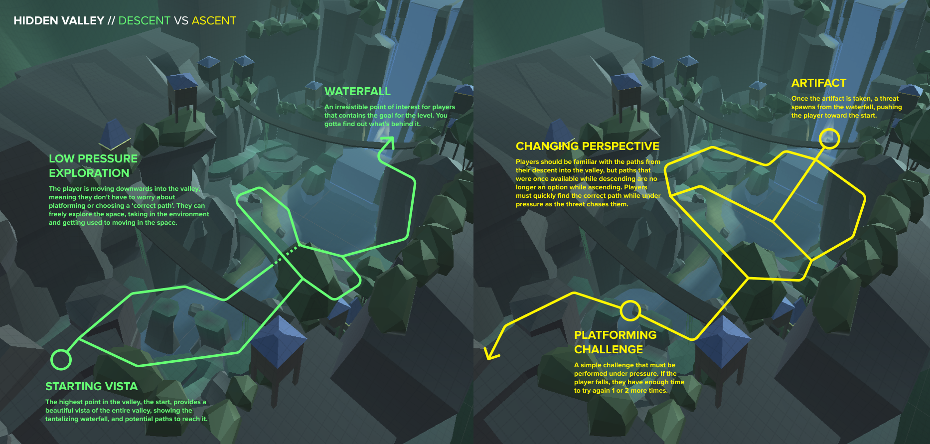
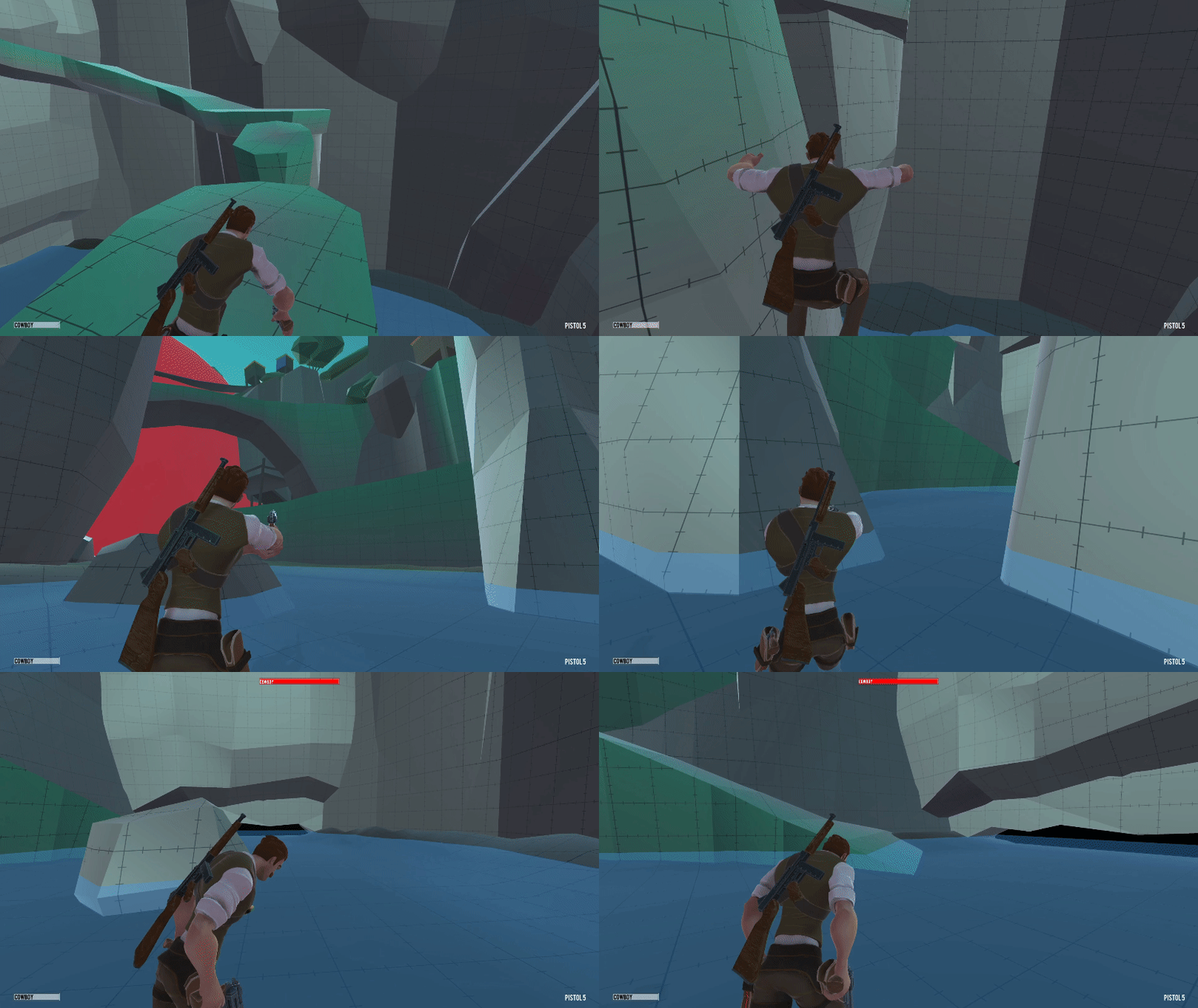
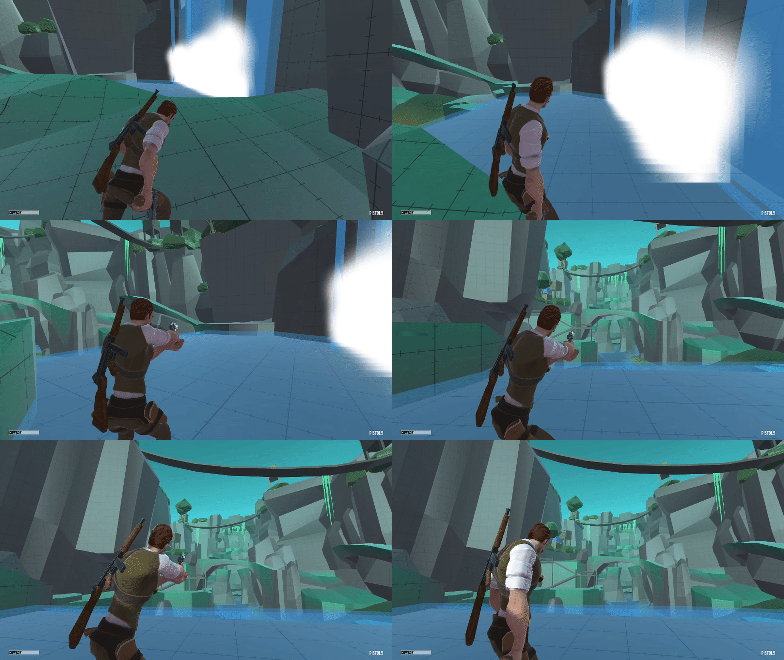
This level was built around having a single vista point with a strong composition. I went with a valley for my environment to take advantage of its natural verticality with parallaxing bridges and rock walls to create a sense of depth. When players reach their goal at the end of the valley, a threat spawns from the waterfall, pushing the player back up to the top. While ascending, players aren’t able to take many of the paths they could take while descending, and must interpret the same space in a different way. Paths will zigzag across the chasm and occasionally loop back, forcing the player to look at the oncoming threat, increasing the pressure to not make mistakes.
BASE INFILTRATION
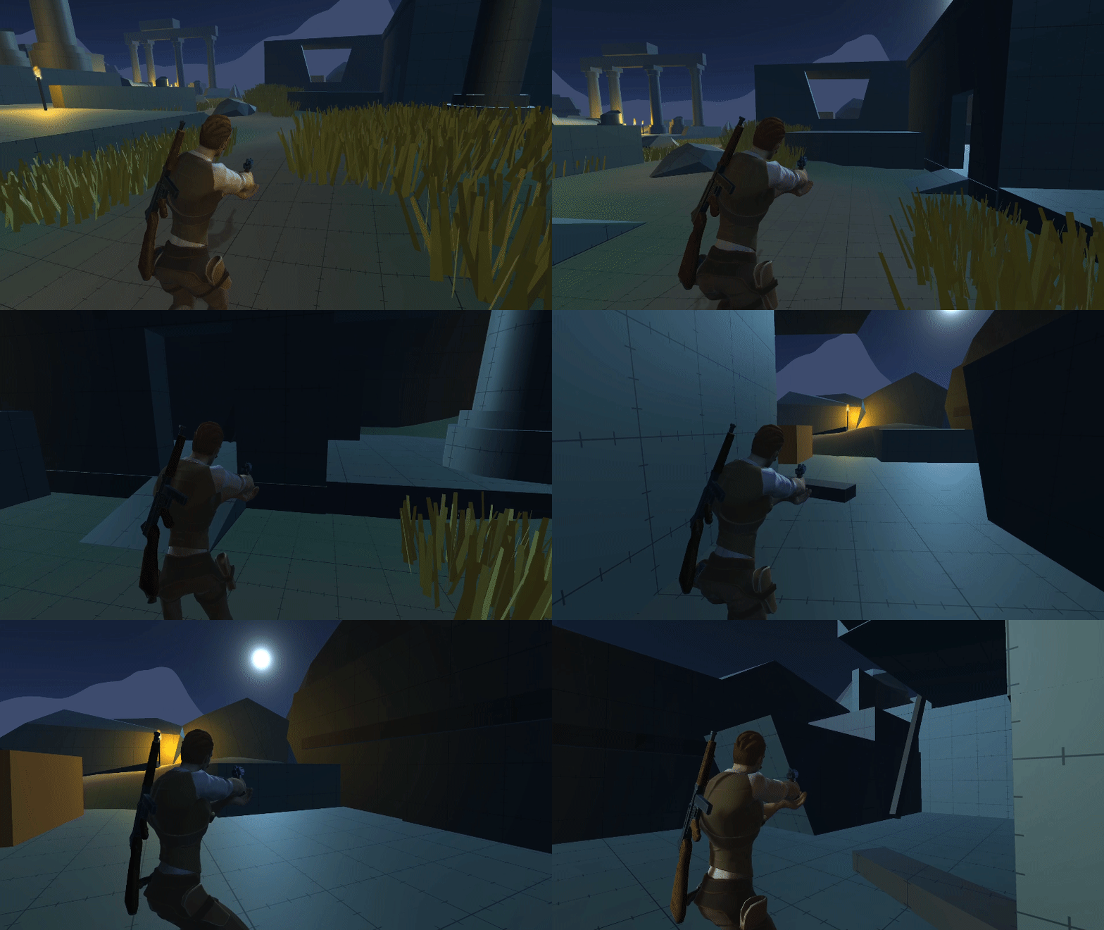
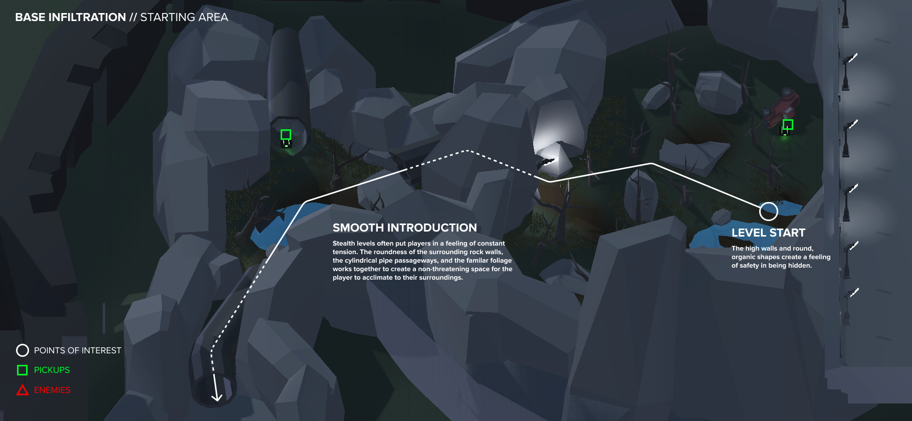
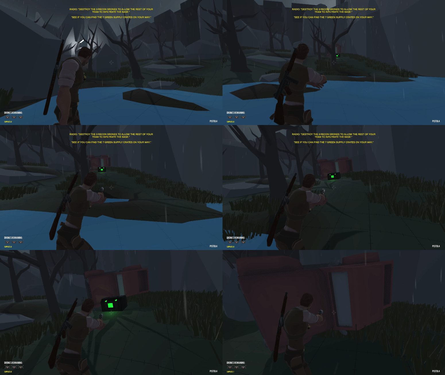
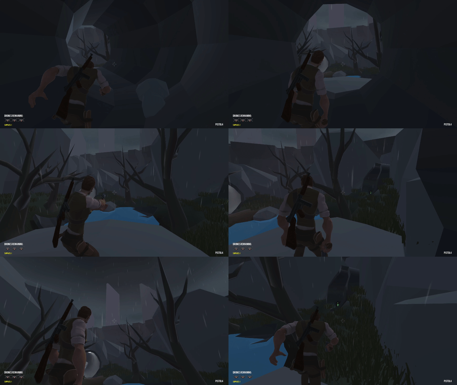
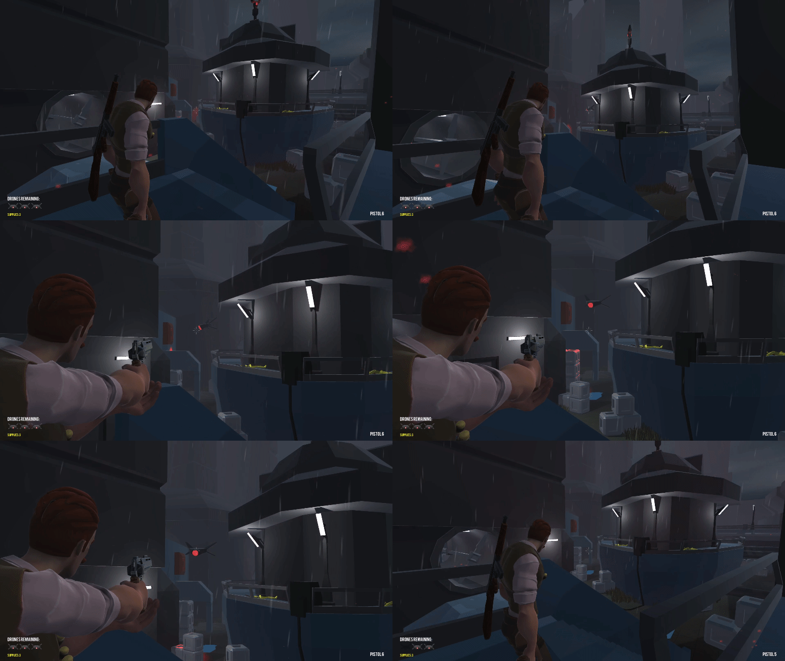
We were tasked with creating a linear level while using spatial design to convey emotion. Some of my most tense memories in gaming have been during stealth missions (like this level in The Last of Us) so I endeavored to create one of my own. The player must destroy 3 patrolling drones while avoiding detection in a perilous dystopian base. Rounder, organic shapes are prevalent during the safer introduction to the level, while sharper, more angular shapes loom over the player during the dangerous stealth portion of the level.
FRIGID CLIMB
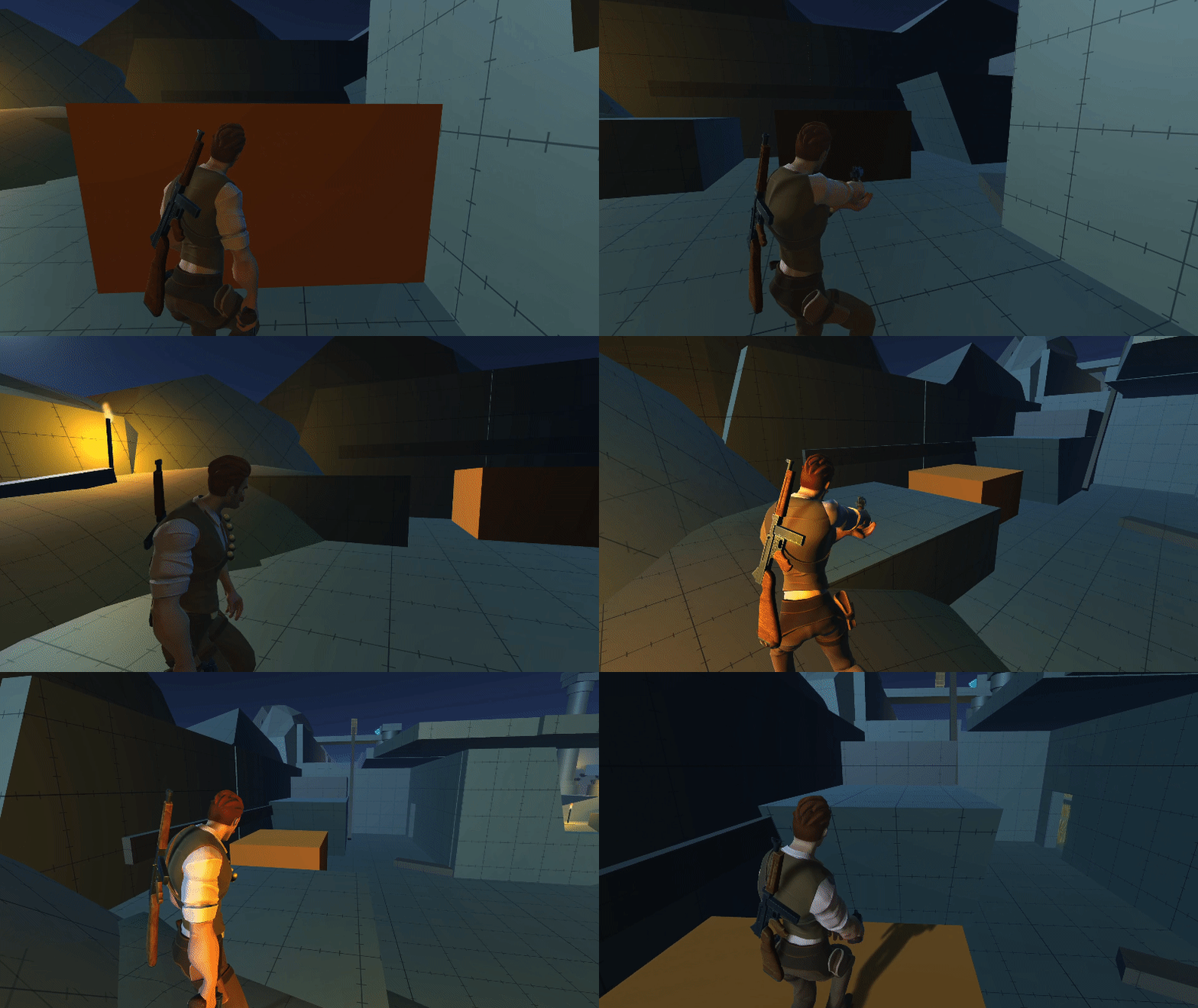
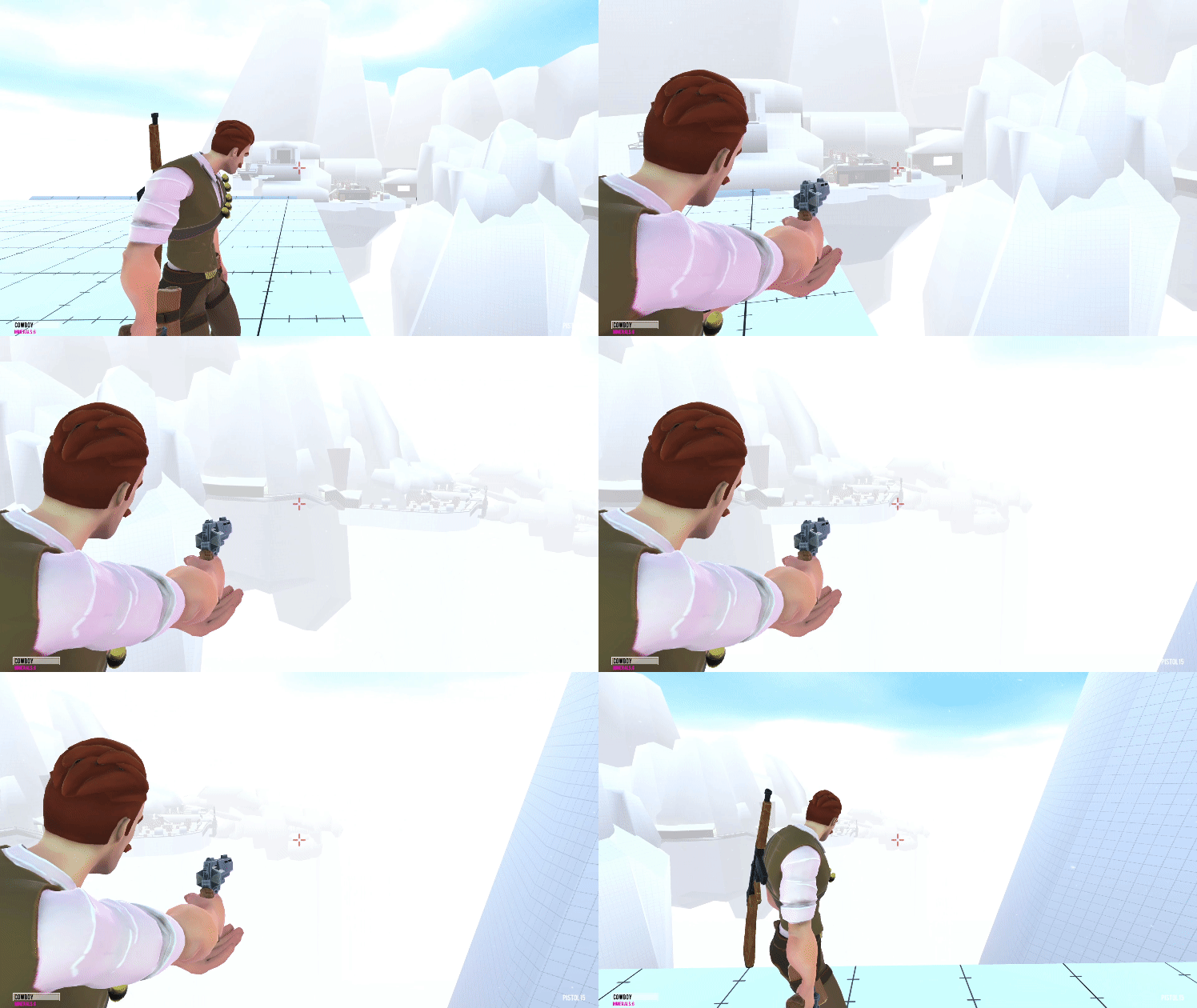
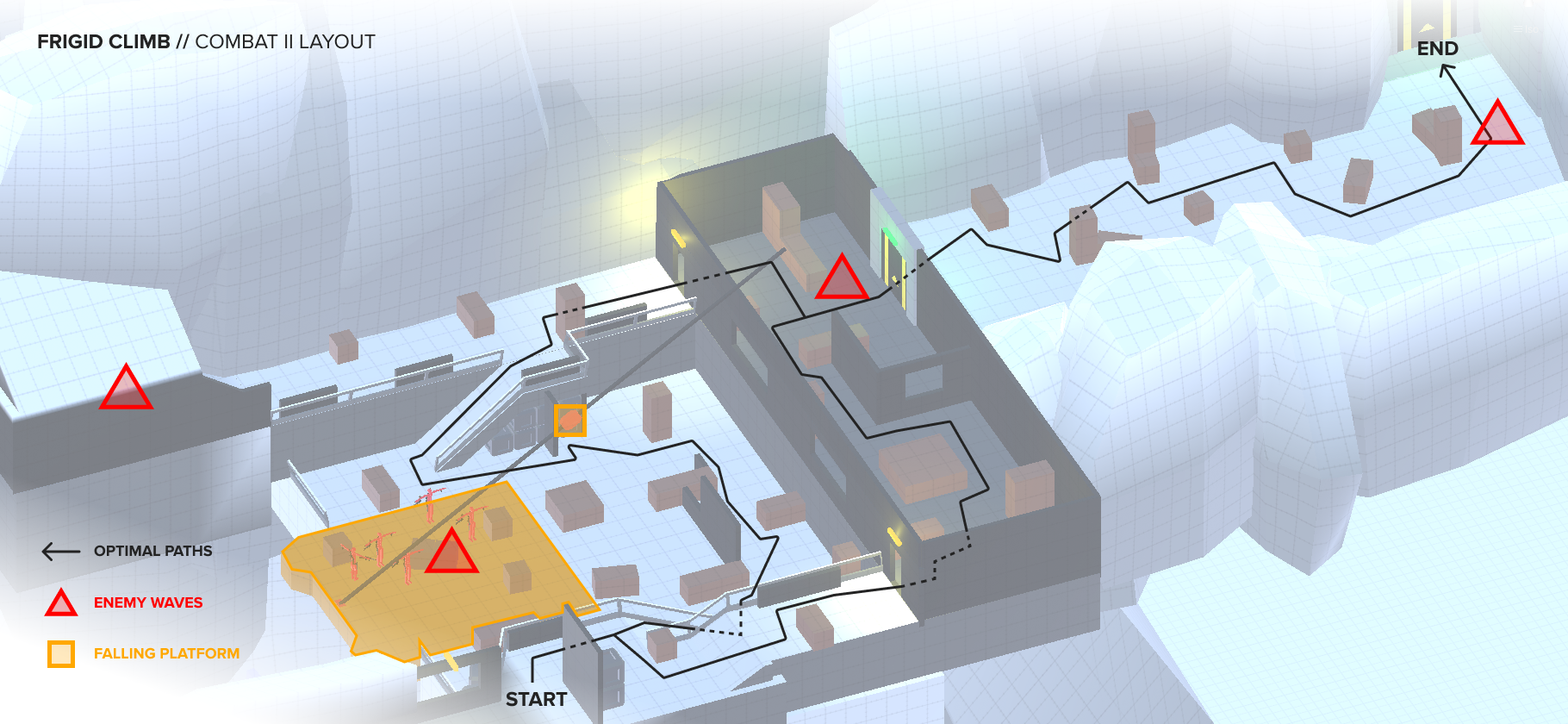
This level was built around having three distinct combat spaces for a 3rd-person, cover-based shooter. To make the level feel like a complete and satisfying experience, I built connective areas to break up the high intensity combat. These areas provide exploration, platforming challenges, and simple puzzle solving. After 9 weeks of this course, I was much more comfortable working with simple scripts and implemented a number of mechanics to supplement the movement and shooting of the player. Players can shatter blue ice by shooting it, causing objects to fall or become unstuck. Collapsing walkways keep the player on their toes as they traverse the icy peaks. Collectibles are strategically placed to act as tiny rewards for exploration.
COMBAT I
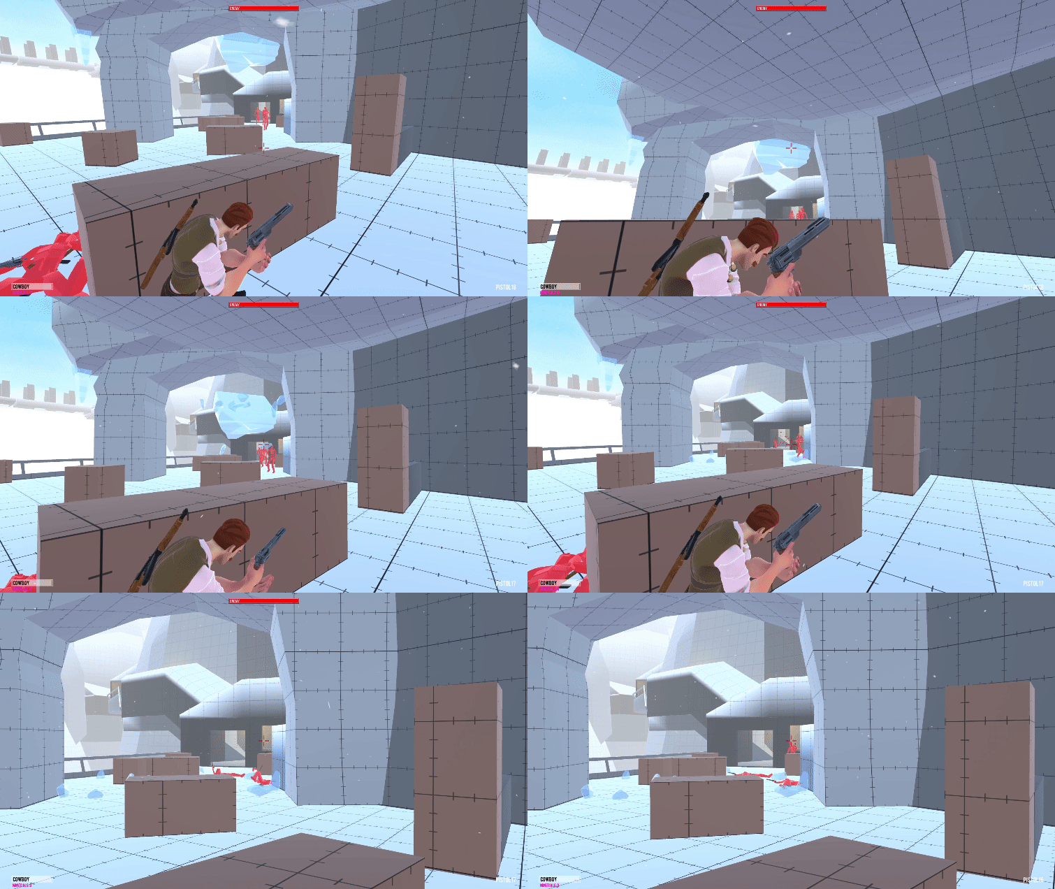
This is the first time players engage in combat so the space is designed to give them a slight advantage. They enter the area from high ground, and the wide open layout gives them strong visibility of oncoming enemy patrols. I reimagined the concept of ‘exploding barrels’ as ‘falling icicles’ to better fit the context of the level. They are strategically placed to fall on hiding enemies when shot by the player.
COMBAT II
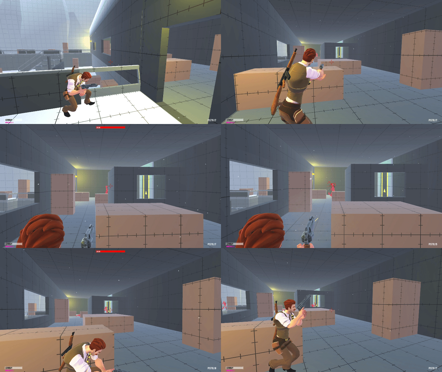
This 2nd space includes cramped indoor spaces, allowing enemies to get closer to the player without them noticing. Players are still given plenty of cover to utilize and a slight vertical advantage to start. To give this space more identity, a large hinged platform sits at its center held up by a large cable. With quick thinking, the player can shoot this cable, causing the platform to fall and plunge the intial wave of enemies to their deaths.
COMBAT III
Right before this final combat, the player is given a slower paced platforming puzzle, and when they do start combat, heart-pounding music disrupts the silence. These contrasting elements heighten the combat’s intensity, providing a more memorable finale. Enemies are also given tactical advantages with high ground and stronger cover. The player must fight their way uphill. weaving between indoor and outdoor spaces.
REFLECTION
This course was an incredible experience and I’m thankful to be able to learn so much from industry veterans like Shane and Emilia. It was also inspiring to work alongside my talented classmates and their weekly feedback was extremely helpful. It felt like we all went into a hyperbolic level design time chamber. At the end of it all, two key takeaways stuck with me. 1 - Space should be carefully crafted to support gameplay. I occasionally tunneled into making more aesthetically pleasing levels, forgetting to give the player enough space to move comfortably. 2 - Make your level as good as you can in the time that you have. I tried to achieve the goals for each week’s lessons, then took a step back to see what extra layers of gameplay I could inject to help the level stand on its own.


